Leveraging data to drive design: Increasing the adoption of T-Mobile MONEY's Direct Deposit
- UX DESIGN
- UI DESIGN
- UX RESEARCH
The Challenge
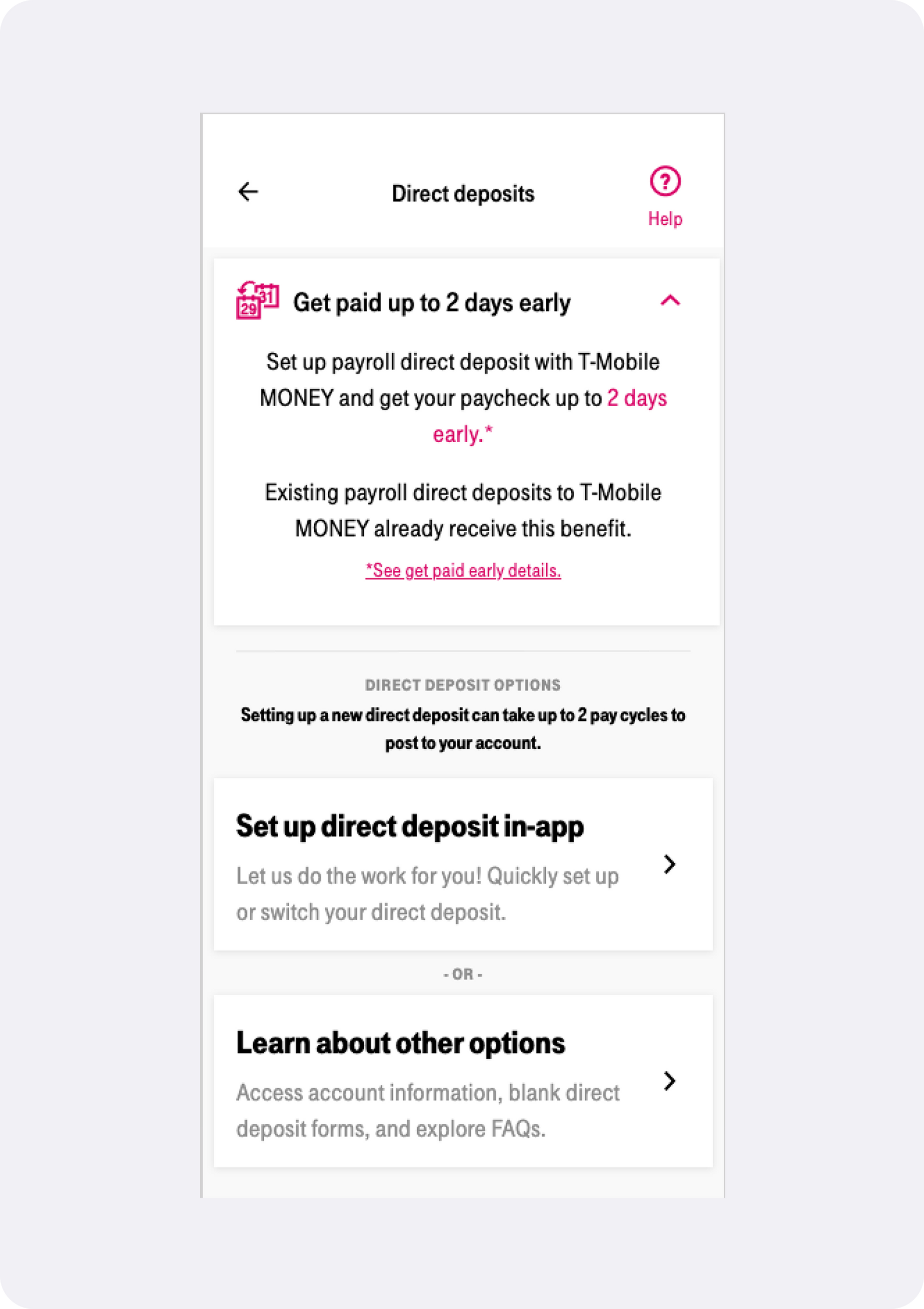
While working on the T-Mobile MONEY application I was asked to find a way to “fix” the Direct Deposit feature - more specifically to determine how we could increase its rate of use. Becoming a common offering of neobanks, we knew there was demand for an automated Direct Deposit service, but the rates of actual usage were extremely low.
Issue 1: Dropoff
When we looked closer at the available, albeit pretty limited, user data we were able to determine that while a significant portion of users were clicking on the CTA to begin setting up their deposit, there was a massive drop-off occurring somewhere within the flow itself. This signified there was potentially a major usability issue within the current flow. One of our major goals for the project became solving this problem and increase the number of users that made if the whole way through the process.
Issue 2: Valid Submissions
Another red flag we spotted was that a massive percentage of account that had submitted a direct deposit switch never showed any direct deposits after that fact on their transaction register. While errors are impossible to prevent 100% of the time, this lack of success seemed improbably high.
In order to be able to measure the projects success, we needed to have a clear and quantitative measure for the issues we hoped to resolve.
In order to that, we determined that the project would ultimately be deemed a success if our hypothesis resulted in a decrease of the flow’s drop-off rate, and an increase to the number of accounts who’s transaction registers showed a successful direct deposit transaction within 30 days of the user entering a request to switch.
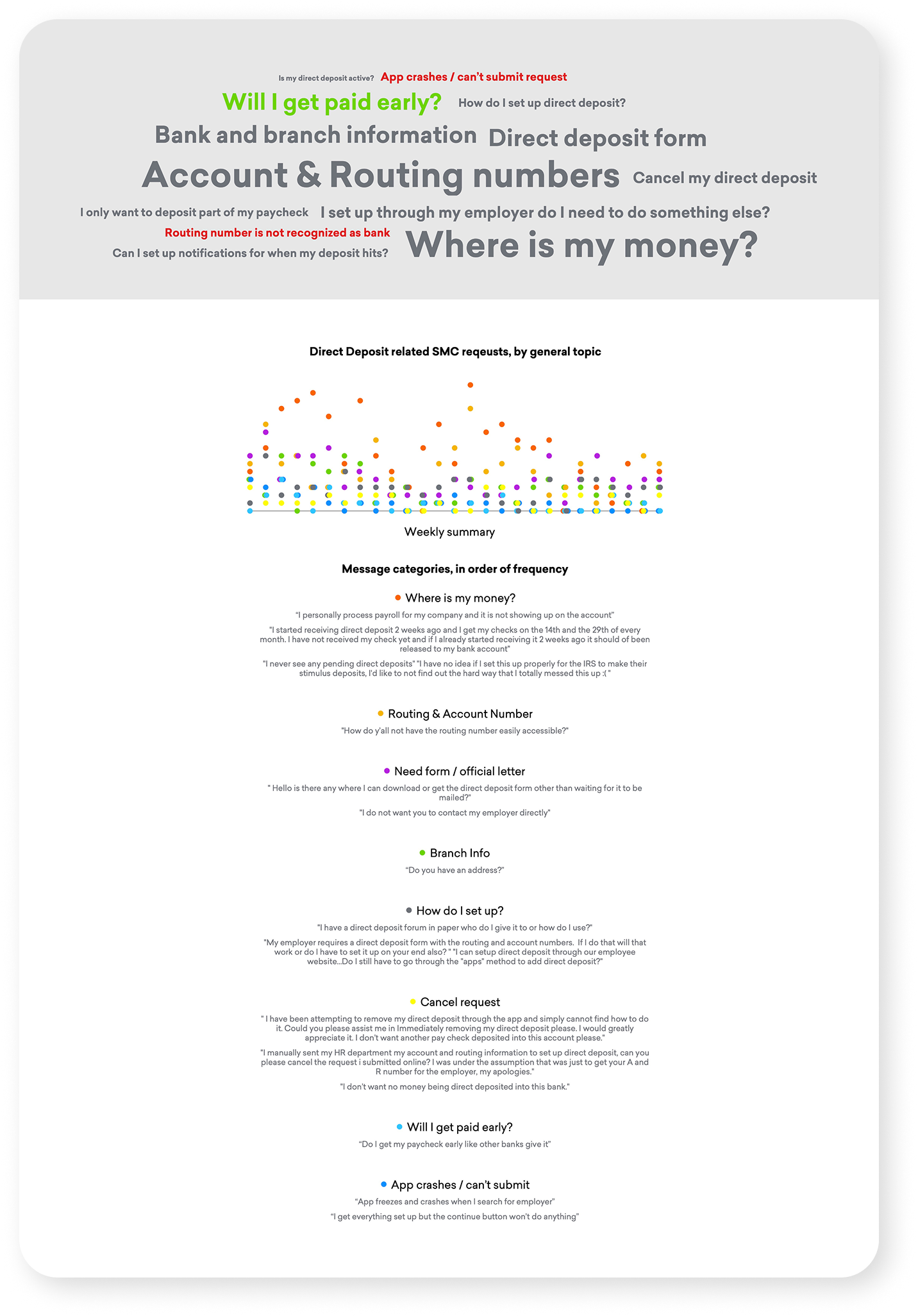
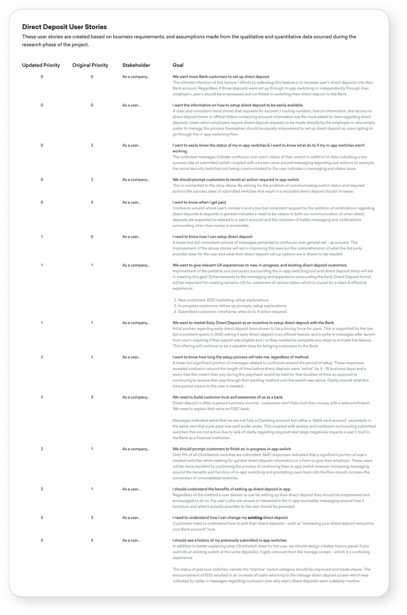
Despite having our metrics on what to improve, we had no idea what was causing the issues. With no timeline or budget for actual user testing, I turned to the application’s customer support messages. After sorting several hundred help requests into related issues it was clear that the bulk of these requests were related to certain aspects of the Direct Deposit experience. I used this information to create a quantified visualization of the app’s major issues based on volume of help request, presented alongside of the user stories we used this data and customer complaints to draft.
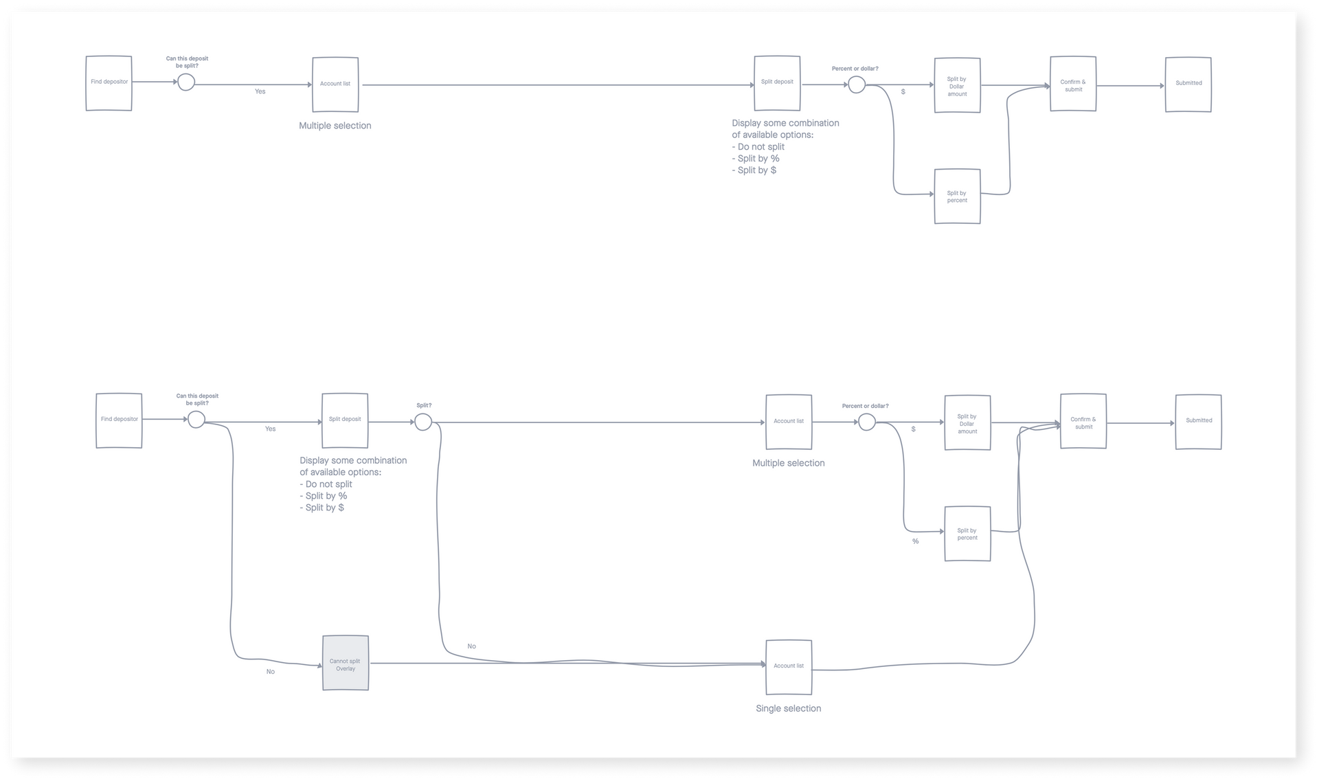
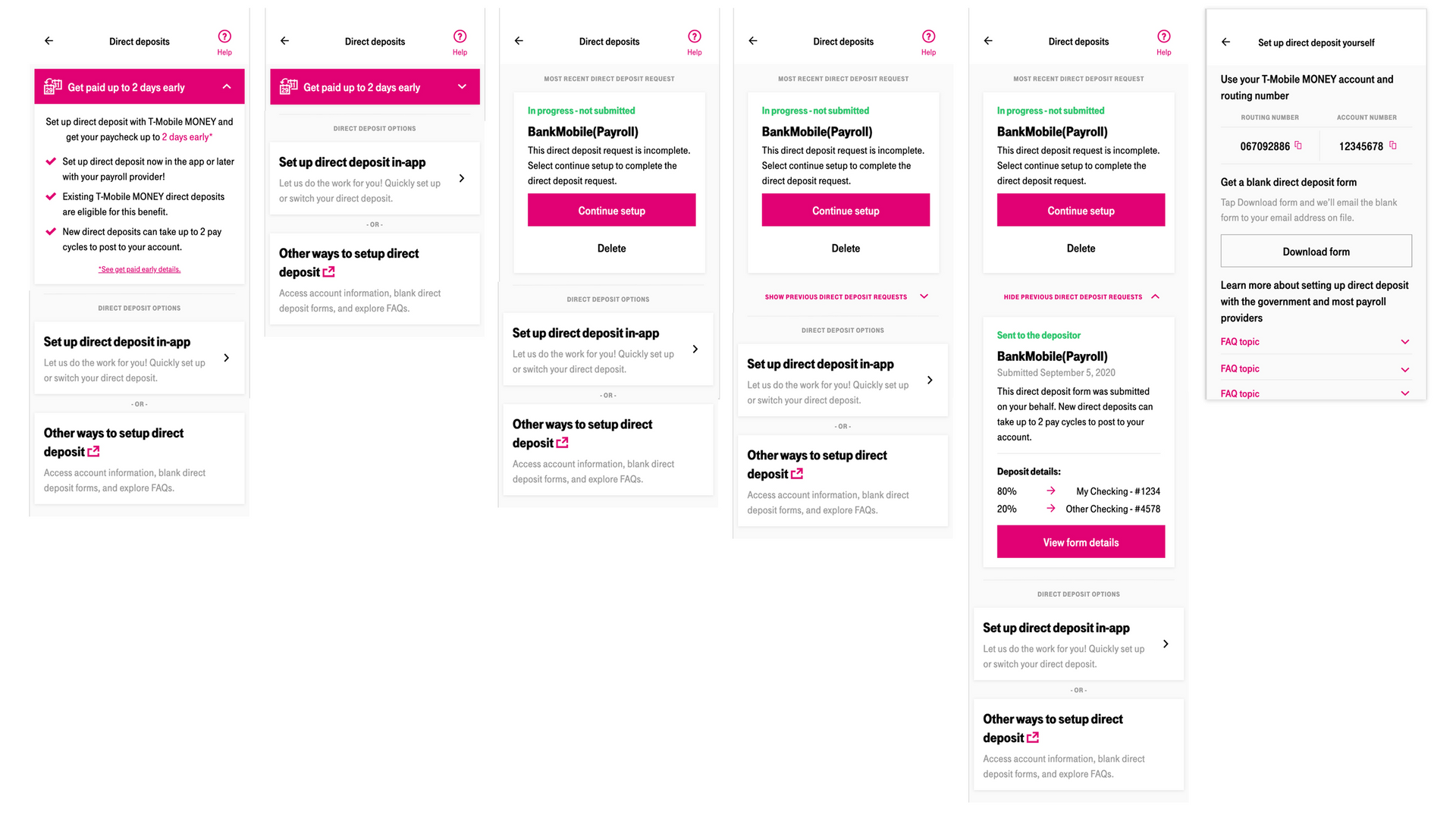
Armed with new context I went back through the original flow, looking for areas that aligned with the confusion points users expressed. Conducting ideation where I began to sketch out just the primary steps and decision points of the experience. One of the most common issues was the fact that users couldn’t tell if their direct deposit request had gone through or not - and historical details of the request where lost after submission. To solve for this, I created an archive view of a users historical direct deposit requests.
We also discovered that some requests would result in additional action or messaging from the service provider, and that our current UI had no functionality to display this additional information. I added a pattern for state based messaging which allowed the display of individual deposit status and to present additional context.